


From Pew Pew Maps to Meaningful Metrics: Security Dashboard Evolution
Join thousands of professionals and get the latest insight on Compliance & Cybersecurity.
You've just spent months implementing a state-of-the-art security monitoring solution. Your team has worked tirelessly setting up data feeds, configuring alerts, and designing dashboards. The centerpiece? A stunning real-time attack map showing colorful arcs shooting across a world map, with attack origins dramatically highlighted in red. It looks like something straight out of a Hollywood thriller.
Your executives love it. They bring in visitors to show off the SOC's massive wall-mounted display. There's just one problem: this impressive visualization provides absolutely zero actionable intelligence for your security program.
Welcome to the world of "pew pew maps" – the flashy but functionally useless security dashboards plaguing organizations everywhere.
"Management loves flashy colors. But I'll be damned if they know what any of it means," laments one security professional on Reddit. This disconnect reflects a fundamental problem in security reporting: what we show versus what actually matters.
The Era of Pew Pew Maps: Style Over Substance
The infamous "pew pew map" – showing real-time attack traffic arcing across a world map – has become so common in security operations centers that the industry has given it a derisive nickname: the "Management Pacification Device."
These visually spectacular maps emerged as security tools evolved to handle the massive log volumes generated by firewalls, IDS/IPS systems, and other security controls. Early SIEM platforms struggled with scalability and usability, leading to dashboards that prioritized simple visualizations over meaningful analysis.
Why do these flashy-but-useless displays persist? Because they create an illusion of security control that satisfies non-technical stakeholders. They transform complex, invisible threats into a digestible visual narrative – even if that narrative has little correlation to actual risk.
Why Pretty Pictures Fail: The Pitfalls of Vanity Metrics
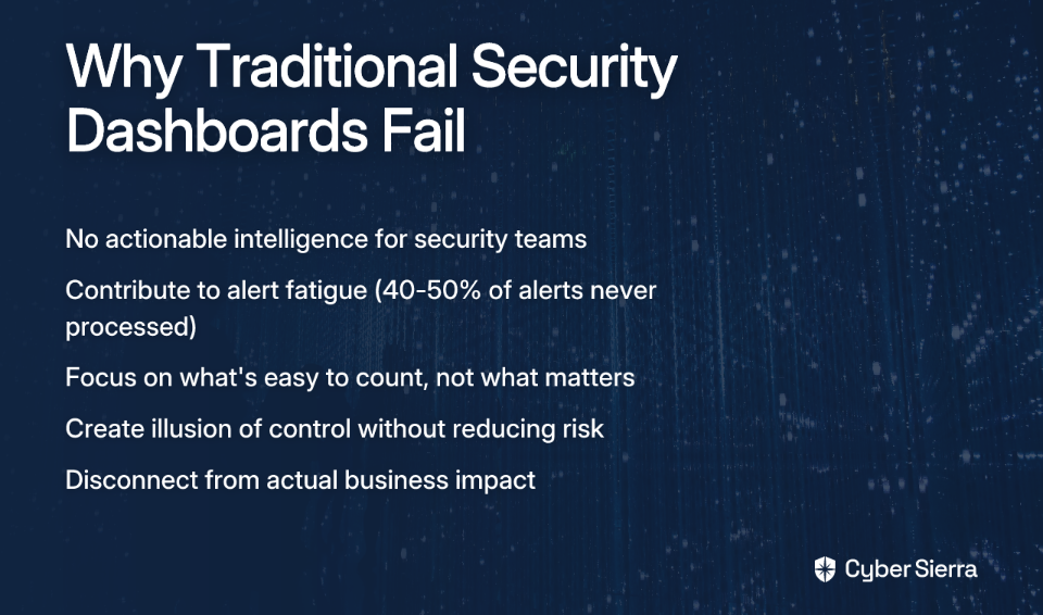
The fundamental problem with most security dashboards isn't just aesthetic – it's philosophical. They focus on what's easy to count rather than what actually matters.
Lack of Actionable Insight
As one security practitioner notes, "each data point should spark an action; showing numbers just because does a disservice to your effort." A dashboard showing 10,000 blocked connection attempts sounds impressive, but what action should you take based on that information? Without context, these numbers are just digital noise.
Alert Fatigue
The deluge of non-prioritized alerts contributes significantly to analyst burnout. According to research from Compact, 40-50% of security alerts are never processed due to overwhelming volume. When dashboards simply display alert counts without intelligent filtering or prioritization, they compound this problem rather than solve it.
Disconnect from Business Risk
Perhaps most critically, traditional dashboards fail to answer the questions leadership actually cares about: "How can you demonstrate the value of this outweighed the cost of labor?" and "How did you connect the metrics to the business?" as executives frequently ask.
A map showing attack traffic from China might look impressive, but it doesn't help you decide whether to prioritize patching that critical CVE on your internal payment server. It doesn't tell you if your security investments are effectively reducing business risk.
The Paradigm Shift: Defining Meaningful Security Metrics
To evolve beyond vanity metrics, we must first understand what constitutes a true security metric.
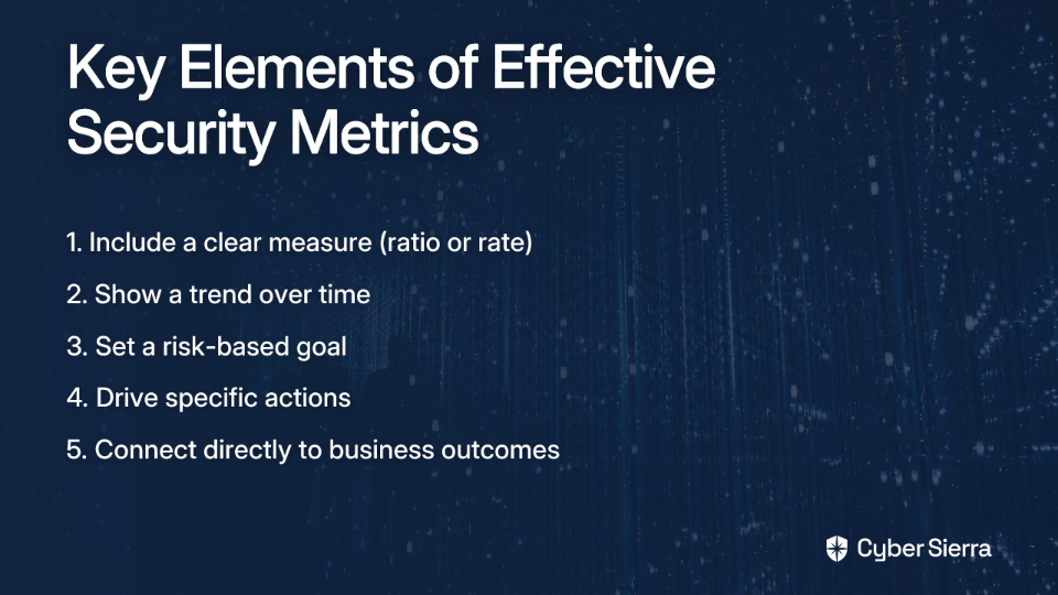
A meaningful security metric isn't just a count or a status. According to guidance from IANS Research, a true metric must include:
- A measure (typically a ratio or rate)
- A trend over time
- A risk-based goal
For example, instead of reporting "1,542 vulnerabilities detected," a meaningful metric might be "Percentage of critical vulnerabilities remediated within SLA, trending over 12 months, with a target of 95%."
Types of Actionable Security Measures
Effective security dashboards should incorporate several types of measures that drive decision-making:
- Burndown Rates: How quickly are risks being remediated? (e.g., vulnerabilities patched per week)
- Survival Rates: How long do threats persist in your environment? (e.g., average dwell time for detected incidents)
- Arrival Rates: How quickly are new risks emerging? (e.g., rate of new critical vulnerabilities discovered)
- Wait Time Rates: What's the time between identification and response? (e.g., average time from alert to investigation)
- Escape Rates: How often do risks bypass controls? (e.g., percentage of incidents that evaded preventative measures)
The Three Cs of Security Metrics
When designing your security dashboard, consider organizing metrics according to the "Three Cs" framework:
- Coverage: How comprehensively are security controls deployed? (e.g., percentage of endpoints with EDR installed)
- Configuration: Are controls properly configured to meet standards? (typically a yes/no status)
- Capability: How effectively do controls manage risk over time? This is the most important "C" as it measures outcomes rather than just implementation status.
A Practical Guide to Building an Actionable Security Dashboard
Step 1: Know Your Audience and Their Needs
Before opening your visualization tool, ask the critical question: "What is their expectation? What data do they care about?" as one Reddit contributor wisely advises.
Different stakeholders need different views:
- Executive Dashboards: High-level risk posture using simple visualizations like traffic lights. Focus on business alignment and governance compliance (e.g., SEC Cybersecurity Rule status). CyberSaint recommends these should translate technical metrics into business impact.
- Security Operations (SOC) Dashboards: Real-time, granular data supporting incident response and threat hunting.
- Compliance Dashboards: Track adherence to frameworks like NIST, ISO 27001, and GDPR, highlighting gaps that require attention.
Step 2: Start with Risk, Not with Data
Instead of asking "what data do we have?" start with "what risks matter most to our business?"
- Identify key business loss types: Data Breach, Business Disruption, Extortion, Wire Fraud
- Map corresponding threats (e.g., ransomware, insider threats) to these loss types
- Design metrics that measure the effectiveness of controls that mitigate these specific threat-loss combinations
This approach ensures your dashboard directly connects security activities to business risks that leadership cares about.
Step 3: Design for Action and Clarity
Effective dashboards incorporate key UI/UX design principles that facilitate quick understanding and response. According to Aufait UX, security dashboard design should:
- Prioritize Critical Insights: Use visual hierarchy to minimize cognitive load and highlight what matters most.
- Design for Quick Response: Include one-click remediation options or drill-down capabilities that enable immediate action.
- Establish Visual Hierarchy: Use size, color, and placement strategically to guide attention to the most important information first.
- Enable Role-Based Customization: Allow users to see the data relevant to their specific role and responsibilities.
- Support Dark Mode: A simple but effective feature for improving readability in SOC environments where analysts work long hours.
Step 4: Demonstrate Policy Adherence
One of the most valuable functions of a dashboard is demonstrating adherence to established security policies. As one practitioner succinctly puts it, "If they have a policy for vulnerability management that says you patch every week, prove it in a dashboard."
Effective policy adherence metrics might include:
- Vulnerability burndown rate for critical CVEs
- Percentage of assets compliant with patching policy SLAs
- MFA coverage across critical applications
- Endpoint compliance with security baseline configurations
The Future is Predictive: The Next Evolution of Dashboards
Security dashboards are evolving from reactive displays to predictive platforms. The journey from first-generation SIEM to modern security analytics platforms represents a fundamental shift in approach.
From SIEM to Intelligent Platforms
Traditional SIEM systems focused on collection and correlation of security events. Modern platforms integrate Big Data technologies, AI, and Machine Learning to provide predictive capabilities. TechTarget's history of SIEM evolution tracks this progression from log management to intelligent analysis.
AI-Powered Insights
Machine learning algorithms can drastically reduce false positives—by over 90% in some implementations like Azure Sentinel—allowing analysts to focus on genuine threats. This represents a quantum leap from traditional rule-based approaches that often generate alert storms.
UEBA and SOAR Integration
User and Entity Behavior Analytics (UEBA) moves beyond static rules to detect anomalous behavior that could indicate an insider threat or compromised account. When integrated with Security Orchestration, Automation, and Response (SOAR) capabilities, dashboards can enable not just awareness but automated response to threats.
From Data Dumps to Decision Drivers
The evolution from "pew pew maps" to meaningful metrics represents more than a visual upgrade—it's a fundamental shift in how security programs communicate value and drive action.
An effective security dashboard isn't just a display; it's a communication tool that bridges the gap between the SOC and the boardroom. It translates technical details into business impact and transforms security data into security decisions.
By focusing on risk alignment, audience needs, and actionability, security teams can transform their dashboards from passive, pretty displays into dynamic engines for strategic decision-making. The result isn't just better-looking dashboards—it's better security outcomes for the entire organization.
Remember: if your dashboard doesn't drive action, it's just digital wallpaper. Make every pixel count.

Frequently Asked Questions
What is a "pew pew map" in cybersecurity?
A "pew pew map" is a visually impressive but functionally useless security dashboard that displays real-time cyberattacks as colorful arcs on a world map. These maps are often called "Management Pacification Devices" because they create an illusion of security control for non-technical stakeholders but provide no actionable intelligence for security teams to act upon. They focus on style over substance, showing a high volume of activity without context or prioritization.
Why are most security dashboards ineffective?
Most security dashboards are ineffective because they focus on vanity metrics, such as raw alert counts, which lack actionable insight, contribute to analyst alert fatigue, and fail to connect security activities to actual business risk. A dashboard showing thousands of blocked attacks looks impressive but doesn't tell a security team what to do next. This deluge of unprioritized information overwhelms analysts and fails to answer the critical questions leadership has about risk reduction and the return on security investment.
What makes a security metric meaningful and actionable?
A meaningful security metric is one that drives a decision and typically includes three components: a specific measure (like a rate or ratio), a trend over time, and a clear, risk-based goal. For example, instead of just reporting "1,500 vulnerabilities found," a meaningful metric would be "The percentage of critical vulnerabilities remediated within our 7-day SLA is currently 85%, trending down from 90% last quarter, with a target of 95%." This format provides context, measures performance against a goal, and indicates whether action is needed.
How can I create a security dashboard that is useful for executives?
To create a useful executive dashboard, you must translate technical data into business impact by focusing on high-level risk posture, governance compliance, and the financial value of the security program. Use simple, clear visualizations like traffic lights (red, yellow, green) to indicate risk levels. Instead of showing vulnerability counts, show the percentage of business-critical systems that are compliant with patching policies. Frame metrics around key business risks like data breaches or business disruption, and connect security investments directly to risk reduction.
What is the first step to building a better security dashboard?
The first and most critical step is to start with business risk, not with the data you have available. Before you build any charts, identify the key risks to your organization, such as ransomware, data breaches, or insider threats. Then, design metrics that specifically measure the effectiveness of the security controls you have in place to mitigate those exact risks. This risk-first approach ensures your dashboard is immediately relevant and aligned with what leadership cares about.
How is AI changing security dashboards?
AI and machine learning are transforming security dashboards from reactive displays into predictive intelligence platforms that can anticipate threats and automate responses. AI-powered tools can drastically reduce false positive alerts by over 90%, allowing analysts to focus on real threats. Technologies like User and Entity Behavior Analytics (UEBA) can detect subtle anomalies that traditional rules would miss. By integrating with SOAR (Security Orchestration, Automation, and Response) platforms, modern dashboards can trigger automated actions, moving from simply showing data to actively driving security decisions.