


Top 5 Tools for Visualizing Asset Relationships and Dependencies
Join thousands of professionals and get the latest insight on Compliance & Cybersecurity.
Summary
- Failing to visualize how digital assets connect creates major risks, including security gaps, compliance failures, and prolonged system outages.
- Tools for mapping asset relationships vary widely, from automated discovery platforms to manual diagramming software for planning and documentation.
- To choose the right tool, you must match its core function—such as application dependency mapping, security analysis, or ITSM—to your specific business needs.
- Cyber Sierra’s Continuous Control Monitoring provides a comprehensive view by mapping assets directly to security controls and compliance frameworks, turning complex data into actionable insights.
You've spent months building out your organization's digital infrastructure, carefully documenting each component in spreadsheets. But when something breaks or an auditor asks how a specific database connects to your customer portal, panic sets in. The spreadsheets don't tell the full story, and the relationships between your assets remain hidden in the minds of various team members.
This disconnect isn't just frustrating—it's risky. As one IT professional noted, "finding a good set of standards to consistently document thousands of relationships seems to lead to misses when we deploy changes." Without proper visualization of how your assets connect and depend on each other, you're essentially flying blind through your increasingly complex digital ecosystem.
The good news? There are powerful tools designed specifically to map and visualize these critical relationships. Let's explore five leading solutions that can transform your tangled web of assets into clear, actionable insights.
1. Cyber Sierra: Comprehensive Security and Compliance Visualization

Overview: Cyber Sierra stands out as more than just an asset mapper—it's an AI-enabled cybersecurity platform that visualizes the critical relationships between your assets, security controls, and compliance frameworks. It excels at answering not just "What is connected?" but "Is it connected securely and in compliance?"
Key Features:
- Central Controls Repository: Builds a central repository for control information with near real-time updates for consistency and easy reference
- Continuous Monitoring: Provides ongoing visibility into security controls, tracks digital assets, and assesses risk in near real-time to proactively fix security gaps
- Multi-Framework Management: Manages controls across multiple compliance frameworks (NIST, ISO 27001, PCI DSS, GDPR, etc.) simultaneously
- Relationship Visualization: Maps controls to specific assets and shows how a single asset's status can impact adherence to multiple frameworks
How It Visualizes Relationships: Cyber Sierra's Continuous Control Monitoring (CCM) module creates dynamic dashboards that show the connections between your digital assets, security controls, and compliance requirements. When viewing these visualizations, you can immediately identify which systems support critical business functions and how a security gap in one component might cascade across multiple compliance frameworks.
For example, if a database server is missing encryption, Cyber Sierra visualizes not only the technical impact but also shows which compliance frameworks (SOC 2, HIPAA, etc.) are affected by this gap.
Best For: CISOs, Compliance Managers, and IT Managers in regulated industries who need to move from periodic, manual security checks to continuous, automated monitoring with clear visualization of control effectiveness.
Learn more about Cyber Sierra's Continuous Control Monitoring

2. Faddom: Agentless Application Dependency Mapping

Overview: Faddom directly addresses a common pain point among IT professionals: vendors claiming to map dependencies "with varying degrees of accuracy and intrusiveness." As a dedicated Application Dependency Mapping (ADM) tool, Faddom offers real-time visibility across hybrid IT environments without the operational disruption of agent installations.
Key Features:
- Agentless Passive Discovery: Deploys in under 60 minutes and operates without requiring agents or credentials
- Real-time Visualization: Creates interactive, always-updated maps showing application connections, ports, protocols, and traffic paths
- Change Management Support: Logs infrastructure and application changes over time for root cause analysis and compliance audits
- Hybrid Environment Mapping: Visualizes dependencies across on-premises, cloud, and containerized environments
How It Visualizes Relationships: Faddom automatically discovers your IT infrastructure and creates visual maps that show how applications, servers, and network components connect and depend on each other. These visualizations reveal hidden dependencies that might otherwise go unnoticed until a critical failure occurs.
When planning changes or migrations, these maps become invaluable for understanding potential impact areas and ensuring nothing gets overlooked.
Best For: IT Operations teams and DevOps engineers who need quick, accurate insights into application dependencies for cloud migration planning, troubleshooting, or change management without deploying agents throughout their environment.
Learn more about Faddom's application dependency mapping
3. Lucidchart / Microsoft Visio: Manual & Collaborative Asset Mapping

Overview: When automation isn't possible or you need to document planned future states, diagramming tools like Lucidchart and Microsoft Visio become essential for manually creating and sharing asset relationship maps.
Key Features:
- Visual Representation: Allows you to visually represent relationships and dependencies between assets with customizable shapes and connectors
- Collaboration: Enables real-time collaboration where multiple stakeholders can contribute to and maintain diagrams
- Templates: Provides pre-built templates for network diagrams, system architecture, and process flows
- Integration: Both tools offer integration with other platforms (Microsoft 365, Google Workspace, etc.) for seamless workflow
How They Visualize Relationships: Unlike automated discovery tools, Lucidchart and Visio put you in complete control of how relationships are represented. You manually drag and drop shapes representing assets (servers, applications, databases) and draw lines with custom properties to show exactly how they connect and depend on each other.
This manual approach, while more labor-intensive, allows you to document conceptual architectures, create standardized representations that follow your organization's conventions, and communicate complex systems to non-technical stakeholders.
Best For: System architects, IT project managers, and technical documentation teams who need flexible visualization tools for planning new systems, documenting existing relationships, or communicating architecture to diverse audiences.
Explore Lucidchart's diagramming capabilities | Learn about Microsoft Visio
4. Gephi: Open-Source Graph Visualization and Analysis

Overview: For teams needing to go deeper than pre-built dashboards, Gephi is a powerful open-source platform for complex network analysis and visualization. It embodies the principles of graph databases, allowing users to explore datasets as networks of nodes and relationships.
Key Features:
- Deep Network Analysis: Enables the creation of dynamic models showing how assets connect and influence each other
- Pattern Identification: Reveals hidden patterns and identifies central assets and clustering within your ecosystem
- Data Flexibility: Imports data from various sources (CSV files, databases) to build powerful graph visualizations
- Advanced Algorithms: Includes built-in tools for statistical analysis, community detection, and centrality measurements
How It Visualizes Relationships: Gephi transforms raw data about your assets and their connections into interactive, explorable graphs. The power lies in applying different layouts, filtering by properties, and analyzing metrics to understand the structure and dynamics of your network.
For example, a security analyst could use Gephi to trace potential attack paths through a network, identifying critical nodes that, if compromised, could impact multiple systems.
Best For: Data scientists, cybersecurity analysts, and researchers who need to perform in-depth, exploratory analysis of large, interconnected datasets. It has a steeper learning curve but offers unparalleled analytical power for those willing to invest the time.
5. ServiceNow: Enterprise-Scale ITSM and CMDB Visualization

Overview: ServiceNow represents enterprise-grade asset relationship visualization integrated into a comprehensive IT Service Management (ITSM) platform. Its Configuration Management Database (CMDB) serves as a single source of truth for all IT assets and their dependencies across the enterprise.
Key Features:
- Automated Discovery & Service Mapping: Automatically discovers IT assets and shows how changes affect applications, helping to prevent outages
- Process Integration: The CMDB is deeply integrated with incident, problem, and change management processes
- Customizable Dashboards: Offers customizable dashboards for tracking IT assets and workflows with real-time updates
- Impact Simulation: Allows teams to simulate changes and view potential impacts before implementation
How It Visualizes Relationships: ServiceNow provides service maps that visually trace the entire stack supporting a business service. When viewing these maps, you can see how web servers, application servers, databases, storage, and network infrastructure all interconnect to deliver a specific business function.
This end-to-end visibility is invaluable during incidents, as teams can quickly identify affected components and understand the broader impact of an outage.
Best For: Large enterprises that need a holistic, integrated platform to manage their entire IT estate and visualize complex service dependencies. It's ideal for organizations looking to mature their ITSM practices and ensure that their CMDB is an active, living repository.
Explore ServiceNow's CMDB capabilities
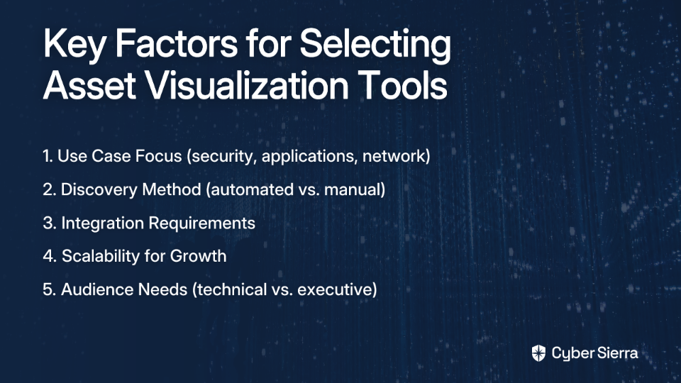
How to Choose the Right Asset Relationship Visualization Tool
When selecting a tool to visualize your asset relationships and dependencies, consider these key factors:
- Use Case and Focus:
- Security and compliance focus? Consider Cyber Sierra.
- Application dependencies and migrations? Look at Faddom.
- Deep network analysis? Gephi might be your best choice.
- Discovery Method:
- Automated discovery (Faddom, ServiceNow) provides accuracy but may require more setup.
- Manual mapping (Lucidchart, Visio) offers flexibility but demands ongoing maintenance.
- Integration Requirements:
- Does the tool need to integrate with your existing systems?
- How easily can it import data from your current asset inventory?
- Scalability:
- Will the visualization remain usable as your environment grows?
- Can the tool handle the complexity of your current and future infrastructure?
- Audience:
- Technical teams might prefer detailed, data-rich visualizations.
- Executive stakeholders often need simplified, high-level relationship maps.
Conclusion: From Invisible to Visible
As one Reddit user aptly pointed out, "data complexity can become overwhelming—even for seasoned data analysts." Without proper visualization, the intricate web of relationships between your digital assets remains invisible—until something breaks.
The five tools we've explored—from the comprehensive security and compliance visualization of Cyber Sierra to the open-source analytical power of Gephi—each offer unique approaches to making these invisible relationships visible.
By investing in the right visualization tools, you transform from reactive firefighting to proactive management. You gain the power to see how changes ripple through your environment, identify critical dependencies before they become single points of failure, and demonstrate to auditors and executives that you truly understand your digital ecosystem.
Remember, the best tool depends on your specific needs, but the goal remains the same: turning overwhelming complexity into clear, actionable insights that drive better decisions and more resilient operations.
Frequently Asked Questions
What is asset relationship visualization?
Asset relationship visualization is the practice of creating visual maps and diagrams that show how an organization's digital assets—such as servers, applications, databases, and security controls—are interconnected and depend on each other. This process transforms complex, spreadsheet-based data into clear, actionable insights about your IT ecosystem.
Why is visualizing asset relationships important?
Visualizing asset relationships is crucial for managing risk, ensuring compliance, and improving operational efficiency. Without clear visualization, organizations struggle to assess the impact of changes, identify hidden security vulnerabilities, respond effectively to incidents, and demonstrate compliance to auditors, essentially "flying blind" through their digital infrastructure.
How do I choose the right asset visualization tool?
To choose the right tool, you should evaluate your primary use case (e.g., security, application mapping), preferred discovery method (automated vs. manual), integration needs, scalability requirements, and the intended audience (technical vs. executive). A security-focused team might choose Cyber Sierra, while a team planning a cloud migration might prefer Faddom.
What is the difference between automated and manual asset mapping tools?
Automated tools, like Faddom or ServiceNow, use discovery agents or agentless methods to continuously scan your environment and create real-time maps of your assets and their connections. Manual tools, such as Lucidchart or Visio, require you to create and update diagrams by hand, offering greater control and flexibility for planning and documentation but demanding more maintenance.
How can asset relationship mapping improve cybersecurity?
Asset relationship mapping improves cybersecurity by providing a clear picture of how assets connect, which helps in identifying potential attack paths and critical vulnerabilities. Platforms like Cyber Sierra take this further by mapping assets directly to security controls and compliance frameworks, allowing you to continuously monitor your security posture and see how a single vulnerability could impact multiple compliance requirements.
Can these tools map relationships in a hybrid cloud environment?
Yes, many modern asset relationship visualization tools are designed to handle complex hybrid environments. Tools like Faddom specialize in mapping dependencies across on-premises, cloud (AWS, Azure, GCP), and containerized infrastructures, providing a unified view of your entire IT landscape regardless of where assets are located.
Which visualization tool aligns best with your organization's needs? The answer lies in understanding not just what assets you have, but how they relate to each other and to your business objectives.