


How to Build a Risk Heatmap That Drives Decisions

Join thousands of professionals and get the latest insight on Compliance & Cybersecurity.
You've spent hours identifying risks, filled out countless spreadsheets, and created a color-coded heatmap that technically ticks all the compliance boxes. Yet somehow, when it's time for critical decisions, your carefully crafted risk visualization sits unused while executives rely on gut feelings or the loudest voice in the room.
Sound familiar? You're not alone. Many risk managers feel overwhelmed by the sheer number of risks they need to track and struggle to prioritize which ones truly need immediate attention. Even worse, what should be a valuable strategic tool often feels like a subjective, box-ticking exercise that fails to drive real action.
"We have this beautiful risk heatmap, but nobody references it when making important decisions," a frustrated risk manager recently shared. "It's like we're creating it just to say we have one."
The good news? It doesn't have to be this way. A properly constructed risk heatmap can transform from a static compliance artifact into a dynamic decision-making engine that cuts through complexity and drives strategic action.
Why Your Current Heatmap Isn't Working
Before diving into building an effective heatmap, it's worth understanding why traditional approaches often fail to influence decisions:
The Subjectivity Trap
Most risk heatmaps rely heavily on qualitative assessments using vague terms like "High," "Medium," and "Low." These subjective labels mean different things to different people, creating inconsistency across teams and making it impossible to truly compare risks.
As noted in Safe Security's analysis, this decreased consistency undermines the credibility of your entire risk management process.
The "Red Box" Problem
When multiple critical risks all end up in the same "red" high-risk box, how do you decide which one to tackle first? Without more granular differentiation, your heatmap fails at its most fundamental job: helping you prioritize.
Lack of Defensibility
Qualitative assessments are difficult to defend under scrutiny. When a board member or executive asks, "Why is this risk red while that one is yellow?" an answer of "because we felt it was more severe" simply doesn't hold water in data-driven organizations.
The Foundation: What Is a Risk Heatmap?
At its core, a risk heatmap is a visual tool used in Enterprise Risk Management (ERM) that displays risks on a grid. According to ISACA, the standard format includes:
- X-axis: Risk Likelihood (the probability of the risk occurring)
- Y-axis: Risk Impact (the potential consequences if the risk materializes)
- Color Coding: Typically using a "stoplight" system where green indicates low risk, yellow indicates medium risk, and red indicates high risk
The fundamental formula underlying every risk heatmap is:
Risk = Potential Impact × Probability of Occurrence
This simple equation forms the basis for prioritizing risks and allocating resources. But as we'll see, how you define and measure these components makes all the difference between a perfunctory exercise and a powerful decision-making tool.
Step-by-Step Guide to Building a Decision-Driving Risk Heatmap
Step 1: Identify and Catalog Your Risks
The foundation of any good risk heatmap is comprehensive risk identification. This isn't a solo activity for the risk manager – it requires collaboration across departments and levels.
Actionable Tips:
- Conduct cross-functional workshops that include both leadership and frontline staff
- Review historical incidents and near-misses to identify patterns
- Consider external factors like regulatory changes, market shifts, and emerging technologies
- Create a standardized risk register to document each risk
Remember that risk identification is not a one-time exercise. As one Reddit user noted, "We don't have a standardized process for updating risk registers," which is a common pitfall. Establish a regular cadence for reviewing and updating your risk catalog.
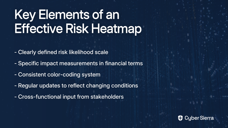
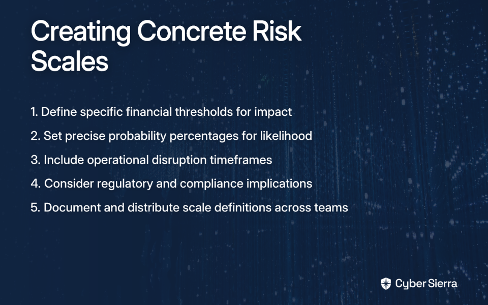
Step 2: Define Your Axes - Moving Beyond "High, Medium, Low"
The power of your heatmap lies in clearly defined, consistent scales for both impact and likelihood. Instead of vague qualitative terms, create specific definitions that everyone in your organization understands the same way.
For example, instead of simply "High Impact," define what that means in concrete terms:
Impact Scale Example:
- Insignificant: Financial loss <$10K, no regulatory implications, minimal operational disruption (<2 hours)
- Minor: Financial loss $10K-$50K, potential regulatory notice, brief operational disruption (2-8 hours)
- Moderate: Financial loss $50K-$250K, regulatory fine possible, significant operational disruption (8-24 hours)
- Major: Financial loss $250K-$1M, serious regulatory penalties, extended operational disruption (1-3 days)
- Catastrophic: Financial loss >$1M, severe regulatory action, prolonged operational failure (>3 days)
Similarly, define likelihood in concrete terms:
- Rare: <1% chance annually (less than once in 100 years)
- Unlikely: 1-10% chance annually (once in 10-100 years)
- Possible: 10-50% chance annually (once in 2-10 years)
- Likely: 50-90% chance annually (once in 1-2 years)
- Almost Certain: >90% chance annually (more than once per year)
These specific definitions create a "common language for risks" across your organization, as recommended by ISACA.
Step 3: Quantify Your Risks for True Prioritization
This is where transformative risk heatmaps diverge from traditional approaches. Moving beyond subjective assessments to quantitative analysis provides the objectivity and granularity needed for meaningful prioritization.
To quantify effectively:
- Adopt a Standard Risk Analysis Model: Consider using a vetted methodology like FAIR™ (Factor Analysis of Information Risk) to provide structure and consistency.
- Translate Vague Risks into Specific Scenarios: Instead of "Data Breach" as a general risk, define a specific scenario: "A malicious external actor breaches our customer database via a SQL injection vulnerability, resulting in the exposure of PII."
- Gather Real Data: Use internal incident logs, vulnerability scans, industry benchmarks, and expert estimates to inform your analysis.
- Apply Monte Carlo Simulation: Rather than single-point estimates, use simulation to model a range of potential outcomes, providing a more realistic view of possible losses.
The result is a quantified risk measured in financial terms (e.g., Annual Loss Expectancy), which allows for much more precise prioritization than traditional red/yellow/green classifications.
Step 4: Visualize and Plot the Heatmap
With quantified risks in hand, you can now create a truly informative heatmap. Map your quantitative ranges back to your color-coded grid:
- Green (Low Risk): Annual Loss Expectancy < $50,000
- Yellow (Medium Risk): Annual Loss Expectancy $50,000 - $250,000
- Red (High Risk): Annual Loss Expectancy > $250,000
This approach provides the simple visual communication benefits of a heatmap while being backed by robust, quantitative data.
Pro tip: Consider adding sizing to your risk dots on the heatmap to represent a third dimension, such as control effectiveness or speed of onset. This adds another layer of decision-relevant information to your visualization.
Step 5: From Visualization to Action - Developing Mitigation Strategies
A heatmap that doesn't drive action is just a pretty picture. For each high-priority risk (red/yellow), define a clear mitigation strategy:
- Identify Root Causes: Determine why a risk is significant to implement the most effective control
- Define Response Options: Consider whether to accept, transfer, mitigate, or avoid each risk
- Assign Ownership: Designate responsible parties for implementing mitigation measures
- Set Deadlines and Milestones: Create a timeline for implementation and risk reduction
- Allocate Resources: Ensure sufficient budget and personnel are dedicated to high-priority risks
This step transforms your heatmap from a passive visualization into an active project management tool that drives concrete actions.
Best Practices for a Living, Breathing Heatmap
Get Senior Management Buy-In
Ensure top-level management understands and supports your risk management framework. Present the heatmap in executive meetings and demonstrate how it can inform strategic decisions.
Revisit the Heatmap Periodically
A risk landscape is not static. Schedule regular reviews (quarterly at minimum) to update your heatmap with new threats, changes in the business environment, and the effectiveness of implemented controls.
Use as a Communication Tool
Leverage the heatmap in board meetings and stakeholder updates to clearly communicate the organization's risk posture. The visual nature makes complex risk information accessible to non-technical stakeholders.
Supercharge Your Heatmap with Automation and Real-Time Data
While the quantitative approach described above is powerful, it can be data-intensive and difficult to maintain manually. This is where modern risk management platforms can transform your approach.
Solutions like Cyber Sierra's Governance, Risk & Compliance (GRC) platform can automate much of the data collection and analysis needed for an effective risk heatmap:
- Automated Data Collection: Instead of manually gathering information, platforms like Cyber Sierra automate data collection from your systems, providing an accurate foundation for risk assessments.
- Continuous Control Monitoring: Your risk levels are directly tied to the effectiveness of your security controls. Cyber Sierra's Continuous Control Monitoring provides near real-time visibility into whether your controls are working as intended, allowing your heatmap to reflect your actual security posture, not just a point-in-time assessment.
- Real-Time Threat Intelligence: A dynamic heatmap must account for emerging threats. Cyber Sierra's Threat Intelligence module performs continuous vulnerability scanning and provides a security scorecard, feeding live data about your attack surface directly into your risk calculations.
By integrating these automated data streams, your risk heatmap becomes a dynamic dashboard that supports truly informed decision-making rather than a static report that quickly becomes outdated.

Conclusion: Your Strategic Compass
A well-constructed risk heatmap should be more than a compliance artifact. By moving from a subjective, qualitative model to a data-driven, quantitative approach backed by automation, your heatmap becomes a powerful tool for strategic planning and resource allocation.
Remember, the goal isn't to create a perfect picture – it's to foster better conversations, allocate resources more effectively, and make defensible decisions that protect and grow your business.
Take the first step today by better defining your risk criteria or exploring how automation can provide the real-time data needed for a truly effective heatmap. Your future self (and your executive team) will thank you when critical decisions are backed by clear, data-driven risk intelligence rather than gut feelings or the loudest voice in the room.
Frequently Asked Questions
What is a risk heatmap and what is it used for?
A risk heatmap is a visual tool used in risk management to represent risks on a two-dimensional grid, typically mapping the likelihood of a risk occurring against its potential impact. Its primary purpose is to help organizations prioritize risks by providing a quick, visual overview of the most significant threats. By color-coding risks (usually red for high, yellow for medium, and green for low), stakeholders can easily identify which issues require immediate attention and resources.
Why are traditional risk heatmaps often ineffective?
Traditional risk heatmaps often fail because they rely on subjective, qualitative labels like "High," "Medium," and "Low," which are interpreted differently by various stakeholders. This subjectivity leads to inconsistency and makes it difficult to compare risks accurately. Furthermore, multiple critical risks often get clustered in the same "red box," failing to provide the granular detail needed for true prioritization.
How can you make a risk heatmap more objective?
To make a risk heatmap more objective, you should replace vague qualitative terms with specific, quantitative scales for both risk impact and likelihood. This involves defining impact in concrete financial terms (e.g., "Financial loss >$1M") and likelihood with statistical probabilities (e.g., ">90% chance annually"). This quantitative approach provides a solid, data-driven basis for prioritization that is both defensible and actionable.
How often should an organization update its risk heatmap?
An organization should review and update its risk heatmap on a regular basis, at a minimum of once per quarter. The business and threat landscapes are constantly changing, so a static heatmap quickly becomes outdated. Regular reviews are necessary to incorporate new threats, account for changes in the business environment, and reflect the effectiveness of newly implemented controls.
What is the most important step in building an effective risk heatmap?
The most crucial step is defining clear, consistent, and preferably quantitative scales for the impact and likelihood axes. This foundational step transforms the heatmap from a subjective exercise into an objective decision-making tool. When everyone in the organization uses the same concrete definitions for what constitutes a "Major" impact or a "Likely" occurrence, it creates a common language for risk that drives meaningful action.